How the Sting will pan out is as follows:
There will be a man that drives a car off of a cliff, which then explodes. The camera then pans up to reveal the wreckage in the shape of the E4 logo. However, all this will take place on a flat surface consisting of a matrix of post-it notes on a wall, much like this video:
So diegetically my Sting will be set around some sort of cliff, but my shooting location will probably be here in W12.
Logistically, the only real problems I see with my idea is that it may end up being more time-consuming than conventional claymation given that I am pre-animating with After Effects in order to provide reference, and buying enough post-its to have a grid sizable enough in order to infer enough detail from it but also not costing thousands.
The TA for my Sting supposedly overlaps with that of E4 itself, given that the aim is for the Sting to be shown on the channel. This means that said target audience will be younger males between the ages of 15 and 25 who are possibly into 'edgy' or 'shock' humour (which my quite dark subject matter will hopefully appeal to).
I have begun planning my Sting proper!
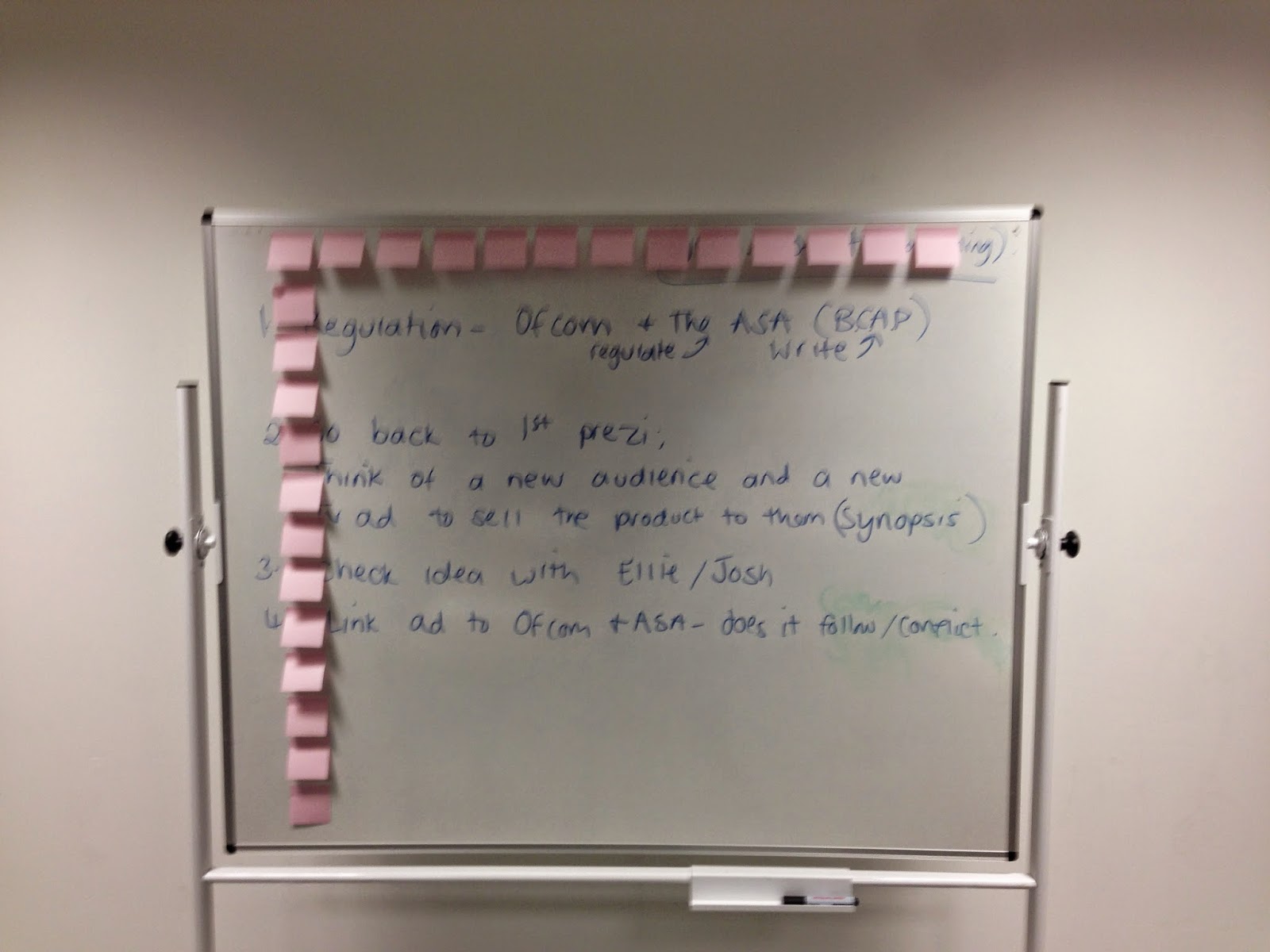
I have acquired myself enough post-its for the task (3 packs worth), but unfortunately they were not the purple that I needed for it to be E4-friendly. Rather, they were quite pink.
So I took it upon myself to try and see if this problem could be rectified in After Effects, and I guess it worked a little bit:
 |
| Original on the left; amended version on the right |
From this image we can then deduce that the amount of post-its we're playing with here is:
13x13 = 169 total post-it notes
Then I had to finalise what was going to happen in my ESting. I wasn't entirely happy with my first idea, so I made a few amendments. It's going to start with the cliff as always, but instead of a man in a car it will be a man who jumps off of the cliff then turns into a big cube which rotates a bit, and then flattens into the E4 logo.
I decided to go with something a little more abstract than my previous idea because I felt like most of the stings we've seen on the website and on YouTube are a lot more 'weird' and 'out-there' than mine was to start with. I also felt like this new, revised idea made more use of my chosen medium, and I feel like it will look a lot 'cooler'. On another point, my first idea was quite gory in nature, and being conscious of the sorts of restrictions TV has it would make sense to go with something a little more tame or non-suggestive in nature.
With that, I began to make a story-board for my sting.
After all the creative pre-production is out of the way it's time for the more administrative stuff.
I started off by taking some pictures of the room I planned to use - W12:
After that I whipped up a quick production schedule:
Finally, all I had left to do was run a quick risk assessment. There isn't a huge amount of risk involved with such a venture as my own, so it's a little empty:
After all the paperwork was out of the way, I could then begin pre-animating in After Effects.
After I began animating in AE it became painfully obvious that a measly 162 post-it notes was not going to provide enough detail for the viewer to be able to see what's going on in the piece. I have increased it to around 50x89 resolution. It seems like a lot, and full-size post-it notes in this amount just won't fit on the board so I will have to quarter them, but I'm hoping that if I put enough work in I will be able to manage it on time.
My preanimation is done! It's finally time to begin animating!


Alex,
ReplyDeleteThis is good detailed work. Please add the pre-production post to this one and delete the other.
Also, please remember to keep the posts 100% formal.
Ellie